The story of Hillbrush begins in 1922 with two brothers, Fred and Bill Coward, who shared a vision and a passion for craftsmanship. They established their business, aptly named “The Hill Brush Company,” at the foot of the prominent Castle Hill, a landmark that continues to define the landscape of Mere to this day. This location not only provided a physical address but also inspired the company’s name, grounding it in the local community from its very inception. Within a few short years, the high-quality brushes crafted by the Coward brothers were finding their way into the hands of workers across Britain, serving a diverse range of needs in streets, farms, and factories.
From the outset, the brothers recognized the importance of branding and sought a distinctive mark to set their products apart. Bill Coward, a keen salmon fisherman, suggested incorporating a salmon into the company logo. This choice was not arbitrary; the salmon, often referred to as the “King of Fish,” symbolized strength, resilience, and quality. By stamping their brushes with this iconic emblem, the Coward brothers not only distinguished their business from competitors but also conveyed a clear message about the superior quality of their products.

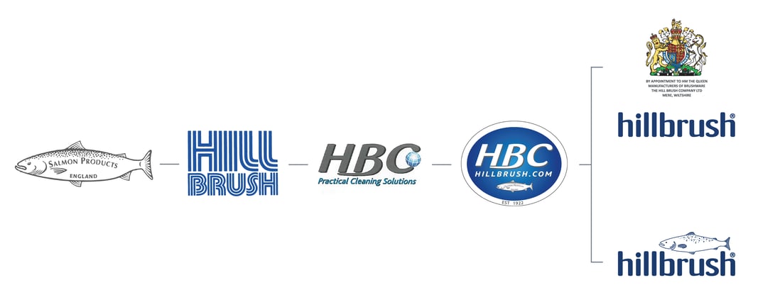
The salmon logo quickly became synonymous with Hillbrush, gaining recognition and building brand loyalty. Its significance extended beyond mere identification; it became a symbol of the company's commitment to excellence. Over the decades, the logo has undergone several design updates to reflect changing aesthetic trends, but the salmon itself has remained a constant, an enduring link to the company's origins and values. This consistent use of the salmon has created a strong brand identity, with many locals and customers worldwide affectionately referring to the company as “salmon brushes,” “the fish brand,” or “the brushes with the fish.” These nicknames, born out of genuine affection and recognition, further solidify the salmon’s integral role in the Hillbrush brand.
A significant milestone in Hillbrush’s history occurred at the end of 2016 with the relocation to a new, state-of-the-art facility at Norwood Park, on the outskirts of Mere. This move marked a new chapter for the company, providing modern facilities and ample space for continued growth and innovation. Coinciding with this relocation, Hillbrush unveiled the latest iteration of its logo, accompanied by contemporary brand guidelines designed to support the business for the next generation of products. While the design was modernized to reflect contemporary aesthetics, the iconic salmon remained a central element, serving as a powerful reminder of the company's rich history and family heritage.

Today, all Hillbrush products proudly bear the company logo, applied through various methods including hot branding, pad printing, and embossing directly into the plastic on some products. This consistent branding reinforces brand recognition and ensures that customers can easily identify the quality and craftsmanship associated with the Hillbrush name. To protect its brand identity and intellectual property, Hillbrush has trademarked its logos and associated brands in accordance with the legal requirements of the countries and legal entities in which it operates.
The evolution of the Hillbrush brand has been a careful balance between adapting to contemporary design trends and maintaining a strong connection to its heritage. The company has successfully navigated this balance, ensuring that its branding remains relevant and appealing while staying true to the iconography that has made it known and loved for so many years. The salmon, a symbol chosen by the founders over a century ago, continues to swim at the heart of the Hillbrush brand, representing quality, tradition, and a commitment to excellence.